How I contributed to a 40 year mystery

As a PhD student, I published a paper with my amazing supervisors at Oxford and my wonderful collaborators at the University of Rochester, in particular Ben Storer. In plain English, this is what it was about.
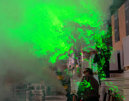
After taking a hot shower, have you ever paused to watch the swirling shapes in the steam? If you haven’t so far seized that opportunity, Figure 1 is quite close to what you would observe. Except, of course, you are able to watch as the vortices swirl and evolve. It’s quite captivating. One aspect that will be easier to see in the simulation below (Figure 2) is the motion at many length scales. There are tiny whirls and huge whorls!
Figure 2: Look at all the little whirls and whorls!
The question of how the energy is divvied up between these scales turns out to be of significant interest. This is because it can offer clues about the nature of the flow itself, pointing us towards which physical processes are driving the turbulent motion. In addition, the distribution of energy amongst length scales can even have implications for our ability to predict the flow into the future!
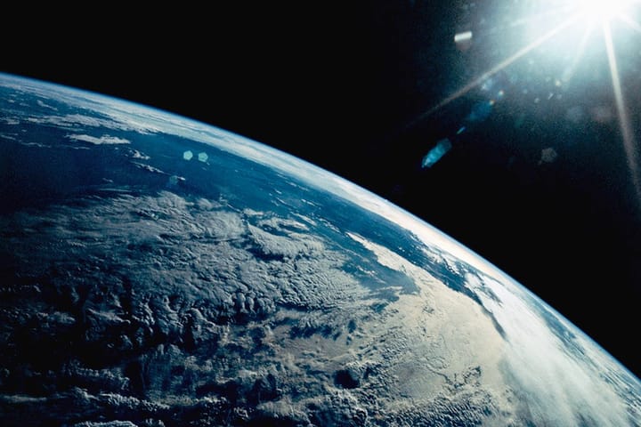
If there is one turbulent flow that humans are interested in predicting, it is the flow of the air around us, the weather! So it should come as little surprise that the distribution of energy at different scales in the atmosphere has been subject to careful measurement. What may be more surprising is that we don’t know why we see what we measure.
In 1984, two scientists, Nastrom and Gage, published their analysis of wind measurements from thousands of commercial aircraft flights. What they found came as a surprise to their colleagues. But to understand why, we are going to need to learn the language we use to talk about these distributions of energy amongst scales, the power spectrum and its spectral slope.
It turns out that in many turbulent systems, the distribution of energy among scales follows, on average, a power law. That is, if you ask me how much energy is in the motions with a length scale \(L\), I take \(L\) to some power, say 3, and multiply it by some number dependent on how much energy is being put into the system, and that is my answer. The formula would be \(E(L) = \alpha L^3\). For reasons that we won’t dwell on here, that power with a negative in front is called the spectral slope and is the main object of interest.
What did our friends Nastrom and Gage see? They saw a slope of -3 at large scales (the same as in my example), but when scales were smaller than about 400 km, the slope changed to -5/3. Why this should happen is what has puzzled the community for so long.
What did we do?
The distributions that are often calculated are found using classical Fourier techniques. Fourier techniques are very good at figuring out exactly which scale energy is in, but are totally clueless about where in physical space that energy comes from. In the atmosphere, this is a big deal. The atmosphere is highly anisotropic, with very different dynamics at the equator, extratropics, and poles, in different seasons, under different conditions such as precipitation, and in mountainous regions compared to ocean regions. To respect this, we instead employed a coarse-graining methodology.
Coarse-graining is, in essence, blurring. Picture a little ring that we will pass over our detailed fluid flow image. Within that ring, we will average all the values, so once we have passed the ring over the whole image, the effect will be a blurring where we can’t see any features smaller than the ring.
How can such an operation clue us in on the energy at each of the present scales? Imagine a wave in our domain with a length scale much smaller than our little ring. This wave is going to be obliterated; we won’t be able to see a trace of it in our blurred image. Hence, the energy associated with it isn’t in the blurred image! Now, if we make the ring a little bigger, after blurring, all those slightly bigger features will be effaced and with them their energy. If we keep track of the total energy at each stage, we can reconstruct how much energy was removed each time we made our ring bigger, and so how much energy was at each length scale!
This operation is aware of where in space that energy was removed from and so for the price of some inaccuracy in which scale the energy was at, we gain the ability to tell where in space it is.
By using this technique, we were able to build the first consistently generated local maps of spectral slope in the mesoscales (the scales where the odd -5/3 slope appears in the global average). We did this at two pressure levels, 200 and 600 hPa. Of these, 200 hPa is the most relevant to the original discussion of the Nastrom and Gage results, but I’ll show 600 hPa, which is right in the troposphere and also very interesting (Figure 3). Redder regions have flatter distributions of energy, that is, relatively more energy in the smaller scales.
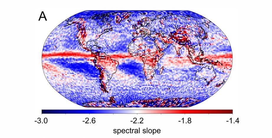
The main instant takeaway from Figure 3 is that it is highly inhomogeneous, with distinct regimes in different regions. We can see a red sash wrapped around the Earth’s equator corresponding to the intertropical convergence zone, where heavy precipitation is common. We see red, shallow slopes associated with orographic features, as we can see running down the spine of the Americas, the Andes and the Rockies. We can see darker blues appearing as latitude increases in the oceans and in the extratropical doldrum regions.
So, in our quest to clarify a 40-year-old mystery, we have instead spawned a host of new questions. It is no longer what causes the -5/3 slope; it is what causes the slope observed in each of these regions. And I think that is pretty cool.
The full paper can be found here: https://agupubs.onlinelibrary.wiley.com/doi/full/10.1029/2024GL110804.


Comments ()